 |
 |
 前号へ
前号へ
このコーナーでは、テンプレートのカスタマイズについて、実際のサンプルページを元に紹介していきます。
皆さん、こんにちは。おちゃのこネットの刑部です。
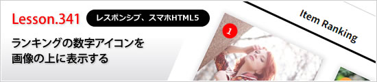
今回のデザイン道場は、前回はランキングのNo.1などのラベルをを数字のみにする方法をご紹介しましたが、今回はその数字を画像内に入れてすっきり表示する方法をご紹介します。
 |
|
 |
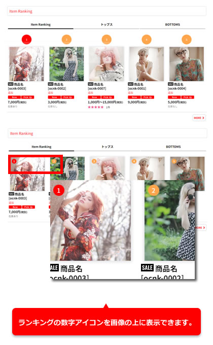 |
デザイン管理→スタイルシートの編集から下記の指定をコピーして貼り付けてください。
※タッチデバイス用(※幅が狭い)とパソコン幅で位置指定を変えています。
.item_rankno {
position: relative;
margin: 0;
}
.item_data .rankno {
display: block;
width: 16px;
min-width: auto;
height: 16px;
margin: auto;
line-height: 16px;
border-radius: 16px;
position: absolute;
top: 5px;
left: 5px;
z-index: 2;
font-size: 10px;
}
@media screen and (min-width: 840px) {
.item_data .rankno {
top: 10px;
left: 15px;
}
}
/* 画面幅が狭い場合に画像を枠に合わせて拡大する */
@media screen and (max-width: 840px) {
.responsive #container .layout_photo .column3 .list_item_photo .item_image,
.responsive #container .layout_photo .square_photo_layout.column3 .list_item_photo,
.responsive #container .layout_photo .list_item_photo .item_image,
.responsive #container .layout_photo .square_photo_layout.column2 .list_item_photo,
.responsive #container .max_column3.align_widths_photo_layout .list_item_photo .item_image,
.responsive #container .max_column3.square_photo_layout .list_item_photo,
.responsive #container .max_column4.align_widths_photo_layout .list_item_photo .item_image,
.responsive #container .max_column4.square_photo_layout .list_item_photo {
max-width: 100%;
}
.responsive #container .layout_photo .list_item_photo {
padding: 0;
}
}
なお、お問い合わせは下記ページからお願い致します。
Copyright (C) 2004-2006 OCHANOKO-NET All Rights Reserved.