 |
 |
 前号へ
前号へ
このコーナーでは、テンプレートのカスタマイズについて、実際のサンプルページを元に紹介していきます。

皆さん、こんにちは。おちゃのこネットの刑部です。
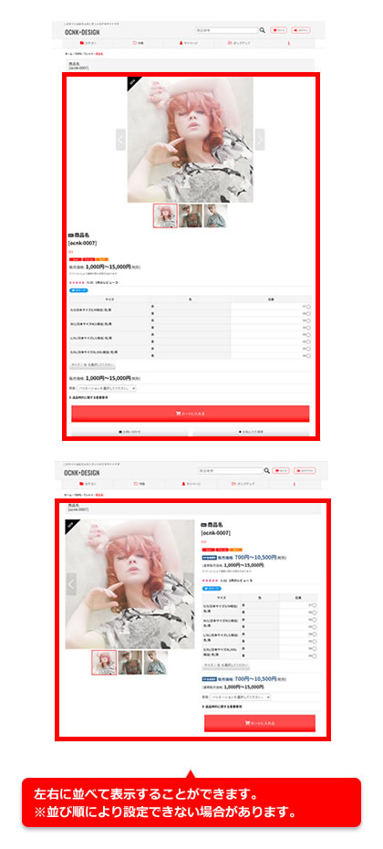
今回のデザイン道場は、商品詳細ページのメイン画像設定を大、中に設定している際に、写真と商品名やカートボタンなどを左右に並べて表示する方法をご紹介します。
※並び順によって設定出来ない場合があります。
 |
|
 |
 |
デザイン管理→スタイルシートの編集から下記の指定をコピーして貼り付けてください。
※横幅840px以上の場合に適用されます。スマートフォンなど幅の狭い端末では縦積みでの表示となります。
※並び順の設定次第では適用されない場合があります。
画像→商品名→カートボタンなどの初期並び順の場合にご利用を推奨します。
@media screen and (min-width: 840px) {
.responsive .large_product_info_wrapper {
display: flex;
}
.responsive #container .large_product_info_wrapper .main_photo_slide {
max-width: 400px;
}
.responsive #container:has(.side_col) .large_product_info_wrapper .main_photo_slide {
max-width: 300px;
}
.responsive #container:has(.side_col) .large_product_info_wrapper .square_photo_slide_400 .item_image_box,
.ocnk011.responsive #container:has(.side_col) .large_product_info_wrapper .square_photo_slide_600 .item_image_box {
width: 300px;
height: 300px;
line-height: 300px;
}
.responsive .large_product_info_wrapper .large_product_info_box {
padding-left: 20px;
padding-right: 20px;
flex: 1;
}
.responsive .large_product_info_wrapper .has_outside_controller .swiper-button-prev {
left: 5px;
}
.responsive .large_product_info_wrapper .has_outside_controller .swiper-button-next {
right: 5px;
}
}
@media screen and (min-width: 980px) {
.responsive #container .large_product_info_wrapper .main_photo_slide {
max-width: 600px;
}
.responsive #container:has(.side_col) .large_product_info_wrapper .main_photo_slide {
max-width: 400px;
}
.responsive #container:has(.side_col) .large_product_info_wrapper .square_photo_slide_400 .item_image_box,
.responsive #container:has(.side_col) .large_product_info_wrapper .square_photo_slide_600 .item_image_box {
width: 400px;
height: 400px;
line-height: 400px;
}
}
@media screen and (min-width: 1200px) {
.responsive #container:has(.side_col) .large_product_info_wrapper .main_photo_slide.align_widths_photo_slide_400,
.responsive #container:has(.side_col) .large_product_info_wrapper .main_photo_slide.square_photo_slide_400 {
max-width: 400px;
}
.responsive #container:has(.side_col) .large_product_info_wrapper .main_photo_slide {
max-width: 600px;
}
.responsive #container:has(.side_col) .large_product_info_wrapper .square_photo_slide_600 .item_image_box {
width: 600px;
height: 600px;
line-height: 600px;
}
}
なお、お問い合わせは下記ページからお願い致します。
Copyright (C) 2004-2006 OCHANOKO-NET All Rights Reserved.